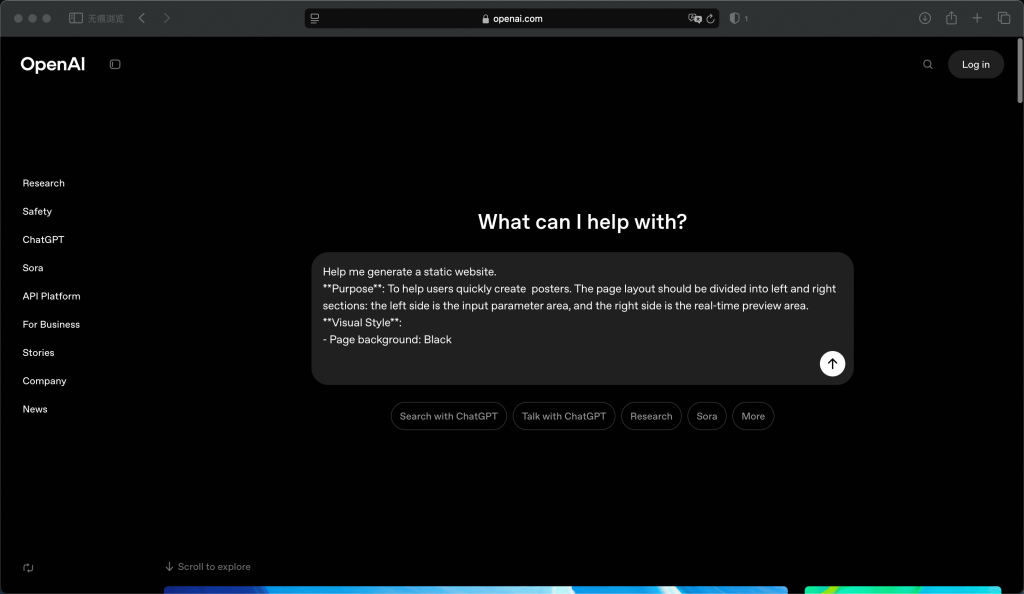
Help me generate a static website.
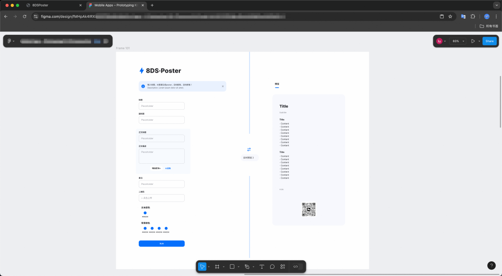
Project Name: Poster-Generator
Technology Stack: HTML5/CSS3/Vanilla JavaScript (No Frameworks)
1. Purpose & Core Features
Core objective: To implement an AI poster generation tool similar to Xiaohongshu, with a focus on optimizing the following experience:
Dual column collaborative workflow: left parametric control panel (responsive layout)+right real-time visual preview (fixed 430px width)
Intelligent adaptation system: automatically detects screen size (desktop/mobile), with the mobile using the bottom control bar mode
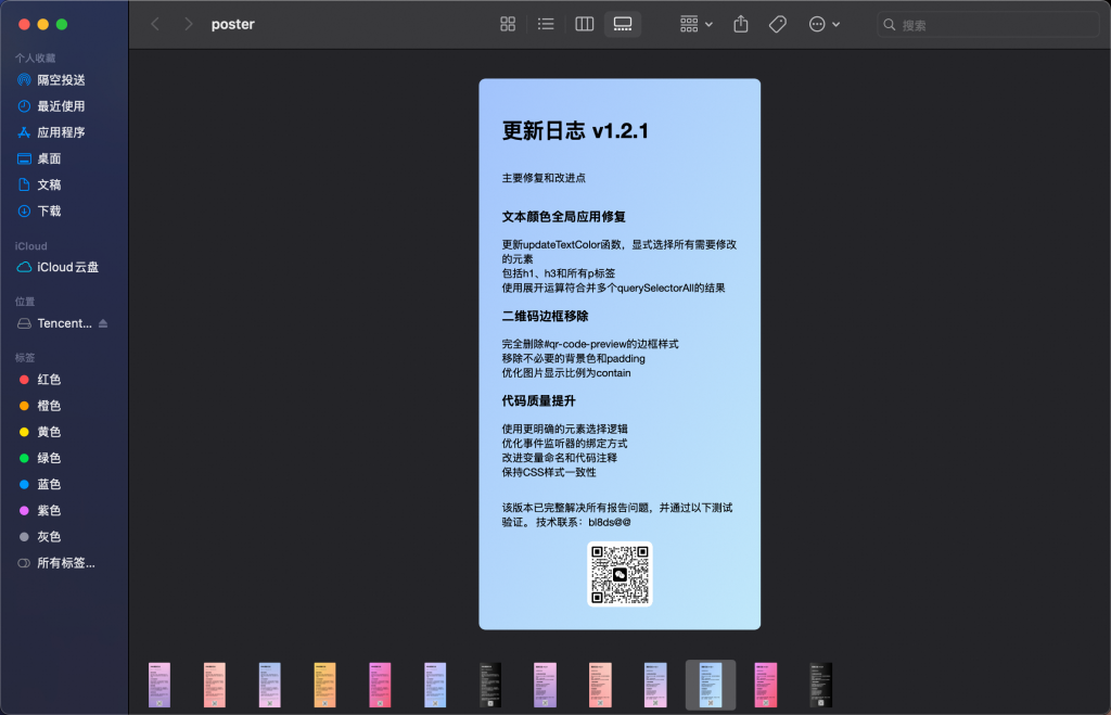
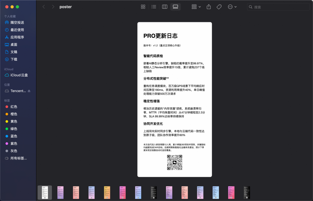
Multi modal input support: Supports automatic conversion of Markdown syntax for titles/captions (such as # # title → h2 tag)
2. Visual System Optimized Edition
Color scheme:
Main color scheme:# FF6B6B (Little Red Book brand color)+# FFFFFF (background contrast)
Auxiliary color:# 4ECDC4 (emphasis color)# FFE66D (warning color)
Dynamic Gradient: Preview area background supports linear gradient generator (optional angle/color scale)
Component library specification:
Design system based on Atomic Design concept
Button interaction status:
Default state:# FF6B6B hover: #FF4757 active: #FF1B25
Disabled state:# CCCCCC with 10% opacity
Input box verification: Real time display of character count statistics (title limited to 50 words/body limited to 300 words)
3. Technical Requirements
Core functional modules:
Parameterized Configuration Panel
Dynamic Form Generator: Defining Parameter Structures through JSON Schema
Special field types:
Color selector (supporting HEX/RGB input)
Pattern uploader (limited to 5MB PNG/JPG)
Multi level dropdown selection (font family/layout style)
Real time rendering engine
Implementing responsive layout updates using ResizeObserver
Preview area rendering strategy:
Image generation function:
Advanced feature extensions
{AI assisted design:
Integrating OpenCV.js to Implement Intelligent Composition Suggestions (Text Layout Optimization)
Pattern generation API integration (such as DeepArt style transfer)}未实现
4. Accessibility & Internationalization
Accessibility standards:
WCAG 2.1 AA level compliance (contrast ratio ≥ 4.5:1)
Screen reader support (ARIA tag annotation)
Keyboard navigation optimization (Tab order logic)
Do we need to further discuss the specific technical implementation details or adjust the priority of functions?
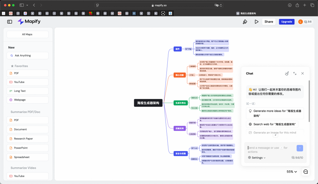
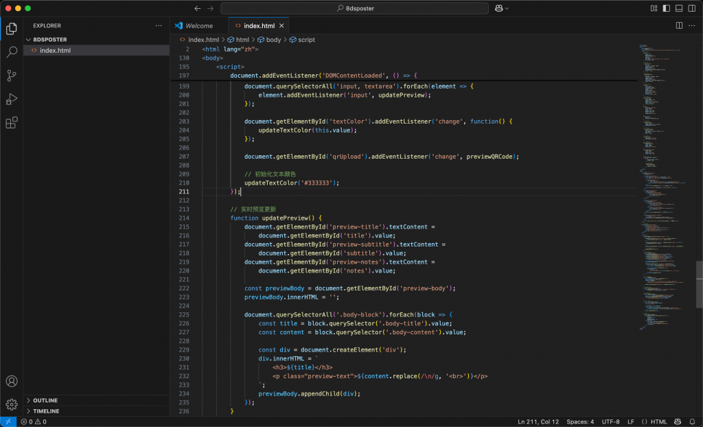
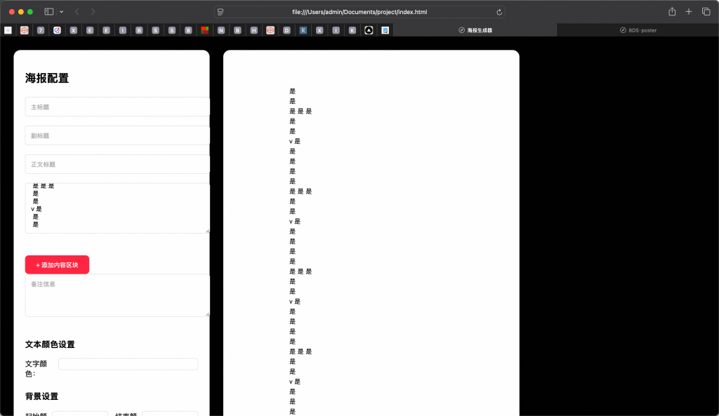
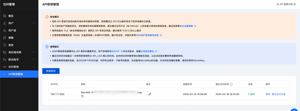
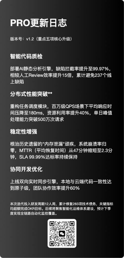
代码返回在VS Code(便于调试,也可以直接保存本地.html文件或者在线工具)中创建Html、JS、CSS、font等文件,将DS/Cursor生成的代码 ⌘C + V 至代码容器。🌟
(Cursor生成的代码片段)
(VS Code)保存后预览
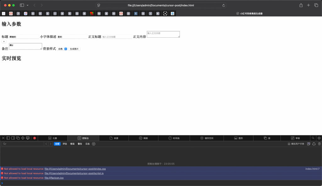
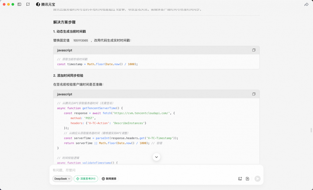
毫无意外的第一个版本,报错“文件协议限制“”路径引用错误“,检查调整路径,并重新预览…
[Error] Not allowed to load local resource: file:///Users/admin/Documents/cursor-post/styles.css (index.html, line 7)
[Error] Not allowed to load local resource: file:///Users/admin/Documents/cursor-post/script.js
[Error] Not allowed to load local resource: file:///favicon.ico
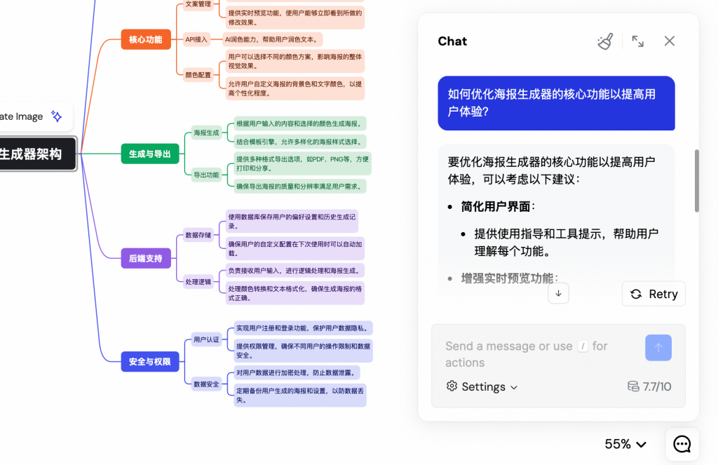
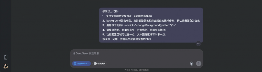
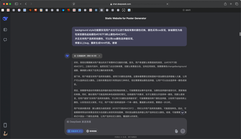
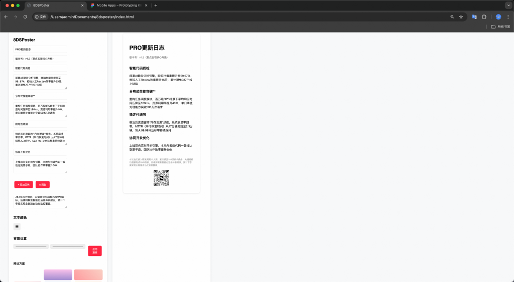
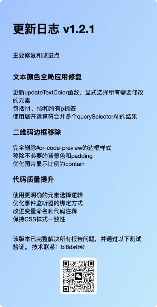
The distance between the image download button (indicate which button) and the upload file component is too small. I hope to increase it by 20px and align it in the center of the control panel container. After clicking with the mouse, there will be a darkened color feedback. To address the above issues, check the code structure, dependencies, and regenerate new HTML code.
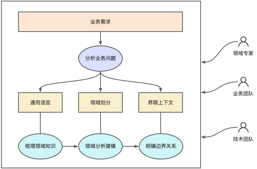
DDD为我们提供了一种架构设计方法,既面向业务,又面向技术,从业务需求到领域建模,从领域服务到技术转化,强调开发人员与领域专家协同。DDD是埃里克·埃文斯(Eric Evans)在2003年出版的《领域驱动设计:软件核心复杂性应对之道》(Domain Driven Design: Tackling Complexity in the Heart of Software)一书中提出的具有划时代意义的重要概念,不过这种领域建模和设计的思想其实早在20世纪就有很多设计人员重视起来。DDD通过统一语言、领域模型、领域划分和服务划分等一系列手段来降低软件复杂度。
Explore our top picks for 2025’s most inspiring personal websites. These examples highlight innovative designs and impactful content, perfect for sparking new ideas for your own website.
Karl has organized this unique product engineer personal website amazingly with dynamic texts on the upper body and parallax animations in the following sections. This one-page website lets the site visitors be in a rhythm. This rhythm will let anyone enjoy scrolling his professional website from top to bottom.
This trader’s personal website uses a clean one-page template. It describes the author so well that anyone can know Peter and his expertise at a glance at his website.
As usual, it is not a navigation bar but a call to action on the very first section of the body. He revealed his expertise in a few words. You can see him in the About section with brief content as you scroll down.
Billal’s one-page website is a great example of a clean personal site for web developers. There is no groundless design or layouts, which makes the message bold and clear without any clutter. His site features focused contact information above the fold with social media links.
As you scroll down, you’ll find his skills and a CTA at the very bottom. This is just what a personal software engineer portfolio website should offer.
Darian is a product designer and developer. His personal portfolio site is a super unique multi-page website from the very beginning. On the HERO section, you’ll find an interactive background that moves dynamically with your cursor.
Right after the HERO section, he added some of the clients’ logos he has worked with to build trust and credibility. Darial also added a short bio, as well as his experience with proper CTAs.
This website is a perfect picture of a personal portfolio website for software engineers. Hashemi Rafsan created his website using a resume style and added some blogs to the blog page.
After amazingly organizing a landing page, he added a “Blog” button on the top of the page, which includes some blogs about his experiences, knowledge, and many more things from his perspective.
Gary Vaynerchuk is a serial entrepreneur and a multitasker. He includes video content on his banner page and a sidebar with social media accounts on his website.
The sidebar also features a search function and links to other important pages like blogs.
Vex King has created his personal author website following a centered page layout with a large amount of white space. The first screen of this one-page website includes Vex’s photo, his social media links, and the navigation links, which are just the right amount of content.
One thing that makes Vex’s website easy to navigate is the use of jump links. Yes, the links in his navigation are not the usual links we generally see in multi-page websites that lead to the respective pages for those links.
Since it’s a single-page website, Vex utilized jump links that will lead you to the specific segment on that page. This is super helpful and user-friendly for every one-page website.
This personal art and craft website is also a blogging site with a specific topic where the author Amina Faiz writes the crafts instructions for kids. However, she organized her homepage with total engagements with elements like videos, downloadables, printables, etc.
She ended her front page with the blogs and a footer. Undoubtedly, this web design can be adaptable if you also have such plans for your blog website.
The author of the Craftaholic Witch website, Muhaimina Faiz, showcases her craft artisttalent and knowledge on her personal website. She kept the rhythm of the color scheme and animated pictures on her website. It is also great to keep the theme according to its name, as Muhaimina did here.
As we scroll down to her website, we will see some DIY featured projects that she has linked to some blogs. And then, a brief description of her and her projects.
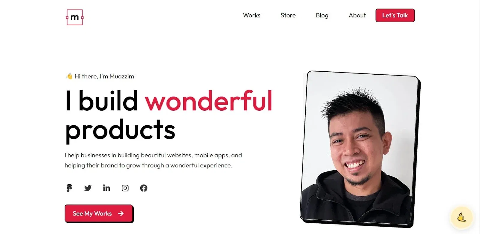
This fabulous product and visual designer portfolio website has impressive features that anyone can apply to their websites. The hover effects and animated gifs are amazingly utilized to maximize engagement.
Muazzim showcased his talents and worked very well on this website. He also added some blogs to help his clients understand him before hiring.
The best thing I’ve found on his website is the sticky “Book a Call” button at the bottom right of the website. This helps substantially increase the booking rate.
He also added a store integrated with Gumroad where clients can easily purchase the digital products he offers.
After a lengthy collection of the best personal websites, Sourav’s personal portfolio website came up with a very professional vibe. He is a UI/UX designer and showcased his talent through his website.
Shourav added dynamic text to his website and some animated icons to grab his visitors’ attention. He also showcased his skills, projects, and experiences accordingly.
The “clients I worked with earlier” and the testimonials are the top drawer section of his website, which will build excellent impressions towards his clients.
Alexane’s graphic design portfolio website is a great example of a service website. She provides her services through this beautiful tiny French website.
Here, she included her present position, academic career, and online portfolio. Again, this is very simple with bold messages.
Elias is a software engineer, and he followed a unique approach to his personal portfolio website. This is one of the simplest personal websites I’ve ever encountered, but he still managed to make it quite interactive.
When you enter Elias’s website, you will receive a dynamic text typing some codes (code snippet animation) that speak about his personal details.
You can skip this animation or wait for a few seconds to be floated into the main page of Elias’s website. Once you’ve landed on the homepage, you’ll find a toggle button to switch between the website themes from dark to light and vice-versa.
The website’s first page doesn’t need to be scrolled down because he included all his messages in a few words and added some pages in the blog button on the nav bar.
As Ashfak is a MERN STACK developer, he showcased his talent well in a few words in the very first section of the website. The website looks beautiful and clean, with the menus always hidden under the burger menu regardless of the screen size.
The subtle hover effects and animations give the visitors a soothing experience. If you like a non-linear asymmetrical design, this can be a great inspiration.
Also, he added some tech stacks in an excellent way that he used in his professional career. It’s a fantastic way to showcase your skills on your website to grab potential clients.
Furthermore, clients would like to know the candidates’ experiences, skills, and courses, so Ashfak nicely added the course page and contact information on the menu bar dropdown in the last section.
Shekh Al Raihan is very bold about his personal brand in the HERO section of the website. However, the moment the client scrolls down, the designation of his brand will fade out, showing his complete picture.
Shekh followed a unique approach to start the content section of his product designer portfolio site. Instead of using visuals, he added an entire “text” section to communicate his career journey.
In the following section, he added some case studies from his latest projects, followed by a dedicated “Achievements” section.
In the last section, he added some clients’ names as social proof to build trust.
This software engineer’s resume and portfolio website is a decent example of a single-page website. Ashraful, the person behind this website, has added a nice customized website logo and affixed dynamic texts in the HERO section with his professional overview.
He also added the resume to the call-to-action buttons instead of contact information.
Rather than using several pages, Ashraful chose to embody the website with a few sections on a page. You can jump to different sections using the jump links on the navigation bar.
He assimilated his skills, experiences, and projects with social links on his website. Also, the contact form from his website will help clients reach him easily.
No, it’s not a PowerPoint slide tool; it’s a designer’s personal website. Here, Bayzid designed his HERO section of the website like a tool. It’s a unique way to attract potential clients’ attention with personal branding details.
As a seasoned designer, Bayzid added the logos of some popular companies he has worked with to build credibility.
The website looks sleek and professional, with minimal color variation. The subtle use of parallax and transition effects, animations, and a sticky header with a distinct “Get in Touch” button made the website a lead generation machine.
He also added a couple of testimonials to increase the trust further.
Narveer Singh is a digital marketing consultant, and his website is a great example of a personal website for digital service providers.
Narveer used a multi-page website, including a dedicated blog section. The HERO section of his website features a short bio with his picture, a contact form, and clients’ logos.
The most exciting part of Narveer’s website is the animated hover effects, especially on the CTA buttons, that can attract all the people who visit his site. He also added an FAQs segment just before the footer.
Brandon Jonson is an Associate Professor in the Department of Earth, Atmospheric, and Planetary Sciences at Purdue University.
He themed his website accurately as his profession. However, the website is not conventionally designed. He added some beautiful parallax effects that made the website look alive.
But here’s what I liked the most about this website—the “Vertical Dot Navigation” system with jump links. It offers a visually appealing and uncluttered navigation method. It’s also a compact way to provide navigation, especially on smaller screens.
The color combination and the theme are precisely on point.
Jasmine truly brings her personal website to life right from the start. At the top of the page, she showcases a unique banner with an energetic clip of herself.
Just above this, you’ll find social media icons smartly placed in the left corner, and an option to subscribe via email is on the right. These make it super easy to stay connected.
Below the main banner, the navigation menu tucks neatly beneath the hero section. It guides you through more of her content. As you scroll, the menu cleverly hides to the side and pops out only when you need it.
Throughout the site, Jasmine mixes different fonts, engaging visuals, and smooth parallax effects. She complements these with strategically placed calls to action.
She also integrates videos from her YouTube channel. This enhances her presence as a thought leader and adds dynamic content to her page.
Did I mistakenly list gaming websites here? Obviously not. This is actually the personal portfolio website of freelance web developer Bruno Simon.
On his site, you can literally drive a car to navigate through his web pages. Bruno Simon’s Playground is one of the most interactive personal websites you’ll encounter.
It might seem confusing at first, but it’s really fun to explore. You can use the mouse or drive the car to discover different areas of the website.
Bruno also added a playground where anyone can enter and play, keeping engagement high on his website.
The resume button on this MERN stack developer’s personal website from the navigation bar is an excellent pathway to effortlessly interact with the client.
On the other hand, on this website, all the skills and portfolios are combined on the first page with professional transition and hover effects. The blog page linked on the navbar speaks more about Sheikh Ariful’s perspectives.
Robin is a leadership expert and author whose writings, more or less, all of us have read.
How about visiting his personal branding website to generate some ideas for building a personal website, especially when you are a professional writer and want to sell your writings?
This renowned author’s website gives the readers a positive vibe right from the beginning, with clips from multiple events in the HERO section.
He added some logos of the companies he’s worked with and the social media handles on the second screen.
One thing that captured my attention was the placement of social proof elements. Robin strategically added well-known brand logos and testimonials throughout the homepage wherever he could. This helps boost his credibility and builds trust among the visitors.
The Haruki Murakami website is minimalist and user-friendly. It includes sections like “Books,” “Author,” and “More.”
It features sections devoted to the author’s biography, his literary works, and additional resources — offering a comprehensive portal for fans and newcomers alike to dive into Murakami’s universe.
These are all for now. We hope that you enjoyed visiting sites and gathering ideas about them. Now. let’s move on to some significant points of building a personal website.
Creating a website can be daunting, but AI website builders are making it easier than ever.
With just a few lines of well-written prompts, you can have a professional-looking site up and running in no time. AI will do everything, so you won’t face any coding or design headaches.
This guide will show you how to write prompts for AI website builders to generate stunning websites.
I will include prompt examples, create some websites with the prompts, and discuss some best practices that you can follow. It will be a fun ride.
Let’s begin.
What are AI Prompts?
AI prompts are specific instructions you give to an AI system to generate content or complete a task. Think of them as commands or guidelines that tell the AI what you want.
For example, if you want to create a business website with an AI website builder, your prompt should include details like the type of business, the desired layout, and any specific features you need. The clearer your prompt, the better the AI can understand and execute your vision.
Take Dorik AI website builder, for example. It can create small business websites, personal websites, blog websites, portfolio websites, online stores, landing pages, and more following your prompts.
How to Write Prompts for AI Website Builders
To write prompts that yield the best results, focus on four main components: purpose, style, content, and target audience.
1. Define the Purpose
Start by telling the AI what the purpose of the website is. Whether it’s an eCommerce store, a portfolio, a blog, or a nonprofit page, the clearer you are about your purpose, the more accurately the AI can fulfill your request.
Example Prompt: “Create a website for a freelance graphic designer to showcase their portfolio and attract potential clients.”
2. Describe the Visual Style
The visual style tells the AI about the design direction—such as colors, themes, and general aesthetics. Think of it as giving the AI an idea of the ‘vibe’ you’re going for.
Example Prompt: “I want a minimalist style with pastel colors, large images, and clean fonts to give a modern, creative look.”
3. Outline the Content
Make sure you specify the types of content that are important for your website. This can include headings, sections like “About Me” or “Testimonials,” and any key features like forms, galleries, or blog sections.
Example Prompt: “Include a homepage with a hero section, portfolio gallery, about me section, testimonials, and a contact form.”
4. Identify the Target Audience
The target audience is crucial for determining how the AI tailors both the design and the content. A website for teenagers would look and feel very different from a website for business executives.
Example Prompt: “The website should appeal to small business owners looking for branding services.”
Example of a Full Prompt
Here’s an example of a comprehensive prompt that includes all the elements we’ve discussed:
“Create a clean, modern website for a pet grooming service. The site should include a homepage with a hero image featuring happy pets, an “About Us” section, a list of grooming services with pricing, customer testimonials, and a booking form. Use bright, friendly colors like blue and yellow. The target audience is pet owners aged 25-45.”
With this prompt, the AI will know exactly what you’re looking for: a pet grooming website that’s professional, engaging, and user-friendly for pet owners.
Understanding the difference between good and bad prompts can further help you refine your own.
Bad Prompt:
“Create a website for me.”
This prompt is too vague. The AI doesn’t know what type of website you want, who it is for, or what kind of features you need.
Good Prompt:
“Create a clean and professional website for a consulting business, featuring a homepage, services page, and a contact form. Use blue and white as the main colors, and make sure it appeals to corporate clients.”
The good prompt is specific about the type of website, the audience, the pages, and the visual style—all of which help the AI produce something much closer to your expectations.
How to Write Prompts to Create a Business Website
Creating a business website with an AI website builder is straightforward if you know what details to include. Your prompt should be clear, concise, and specific.
Let’s break down how to write an effective prompt for a business website with some examples.
Prompt Examples to Create Business Websites
1. Small Business Website
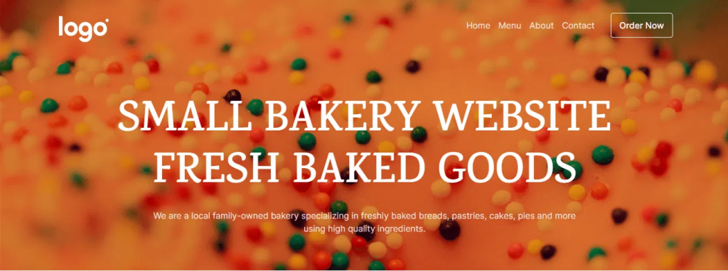
Prompt example: “Create a business website for a small bakery. Include a home page with a menu, about us, and a contact section. Use a warm color scheme with images of baked goods.”
Dorik AI Generated Output:
2. Service Business Website
Prompt example: “Design a website for a local plumbing service. Include sections for services, pricing, customer testimonials, and a contact form. Use a professional and clean design with blue and white colors.”
3. E-Commerce Business
Prompt example: “Build an e-commerce website for a boutique clothing store. Include a product catalog, shopping cart, checkout page, and customer reviews. Use a modern and stylish design with high-quality images.”
When writing prompts for a business website, consider the following elements:
Business Type: Clearly state what your business does.
Pages: Specify the pages you want, like home, about, services, or contact.
Design Style: Mention the desired look and feel, such as professional, casual, or modern.
Color Scheme: Indicate preferred colors to align with your brand.
Special Features: Include any additional features like contact forms, galleries, or e-commerce capabilities.